
Properties
User-editable properties can be added to your custom entities (i.e. your behaviors and components). These make it possible to configure your entity from within the user interface of the 3D editor, thus allowing users to build content using your behavior or component without having to edit its source code.
Types of properties
Section titled “Types of properties”There are two types of properties; Runtime properties and Constructor properties:
| Property type | Description |
|---|---|
| Runtime properties | Can change while your experience is running. They’re great for most of the configurable parameters of your entity, especially those that users of your entity will want to animate. They’re implemented as member variables on your component/behavior class. Examples include position, scale, and rotation. |
| Constructor properties | Have one value for the lifetime of your experience when it’s running on an end-user’s device. For these properties to change, the experience must be reloaded. Constructor properties are great for parameters that result in load times (such as the paths for assets to load). They’re implemented as an object that’s passed into the constructor function of your component/behavior class. |
The table below exemplifies how each property type can be affected:
| Property type | Can be changed during the experience | Can be animated with timelines and states | Fixed value for the lifetime of your experience |
|---|---|---|---|
| Runtime property | ✅ | ✅ | ❌ |
| Constructor property | ❌ | ❌ | ✅ |
Using Runtime Properties
Section titled “Using Runtime Properties”Runtime properties are defined by adding a public member variable to your component or behavior class. Public properties automatically appear in the Node or Behavior properties panels of the 3D editor.
Use
@zIgnore()to hide a property from the editor if you don’t want it exposed.
Let’s take a look at an example:
import { zComponent, zOnBeforeRender } from '@zcomponent/core';import { Group } from '@zcomponent/three/lib/components/Group';import * as THREE from 'three';
@zComponent({ icon: 'favorite' })export class CustomThreeJSComponent extends Group {  public metalness = 0;
  private _material: THREE.MeshStandardMaterial;
  constructor(contextManager: ContextManager, constructorProps: {}) {    super(contextManager, constructorProps);
    // Construct a material for our sphere    this._material = new THREE.MeshStandardMaterial();    this._material.roughness = 0;
    // Construct our sphere, referencing the material    const myObject = new THREE.Mesh(      new THREE.SphereGeometry(),      this._material,    );
    // Add our sphere to this component’s Group    this.element.add(myObject);  }
  @zOnBeforeRender()  private _update(deltaTime: number) {    // Every frame, update the material’s metalness to the most recent    // value from our `metalness` prop    this._material.metalness = this.metalness;  }}
Taking a closer look, we added a public member variable:
public metalness = 0;Then inside our component, we update the material’s metalness from our component’s property in every frame:
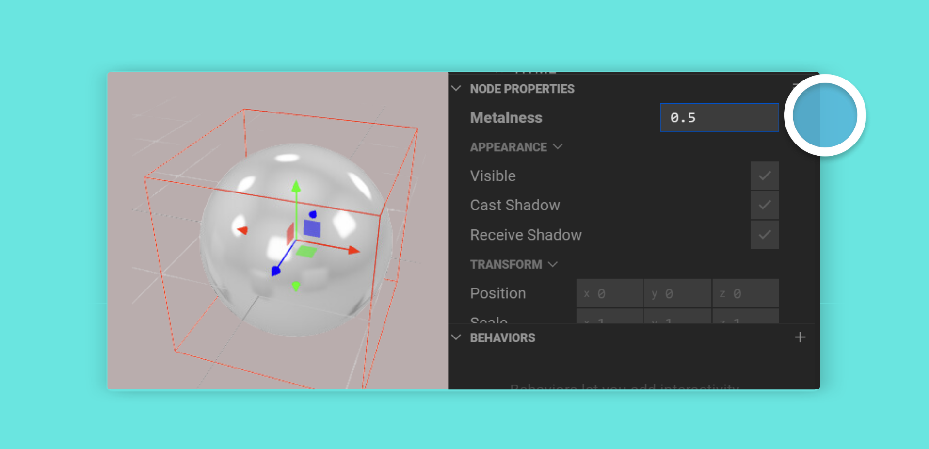
@zOnBeforeRender()private _update(deltaTime: number) { // Every frame, update the material’s metalness to the most recent // value from our `metalness` prop this._material.metalness = this.metalness;}The default value is simply the value you assign to the property (in this case 0). Here’s what the 3D editor shows for our custom ‘Metalness’ property:
Using Observables
Section titled “Using Observables”In our example so far, we update the material’s metalness in every render frame. This is inefficient, since the value of our metalness runtime property does not change every frame - it only changes when the user is editing the property in the input box.
To make this more efficient, Mattercraft provides the @zObserve() decorator. It runs code only when the value of the property changes.
Let’s rewrite our custom component using @zObserve():
import { zComponent, zObserve } from '@zcomponent/core';import { Group } from '@zcomponent/three/lib/components/Group';import * as THREE from 'three';
@zComponent({ icon: 'favorite' })export class CustomThreeJSComponent extends Group {  private _material: THREE.MeshStandardMaterial;
  @zObserve((value, instance) => {    instance._material.metalness = value;  })  public metalness = 0;
  constructor(contextManager: ContextManager, constructorProps: {}) {    super(contextManager, constructorProps);
    // Construct a material for our sphere    this._material = new THREE.MeshStandardMaterial();    this._material.roughness = 0;
    // Construct our sphere, referencing the material    const myObject = new THREE.Mesh(      new THREE.SphereGeometry(),      this._material,    );
    // Add our sphere to this component’s Group    this.element.add(myObject);  }}
Taking a closer look, we add @zObserve() to our property with a callback that runs whenever the value changes:
@zObserve((value, instance) => { instance._material.metalness = value;})public metalness = 0;The callback receives the new value and the component instance, allowing you to update other parts of your component reactively.
The
@zObserve()decorator is more efficient than updating values in@zOnBeforeRender()because it only runs when the value actually changes, not every frame.
Reacting to Value Changes
Section titled “Reacting to Value Changes”Mattercraft provides three ways to react when values change. Understanding when to use each is essential.
| Pattern | Use When | Respects enabled |
|---|---|---|
@zObserve() |
Reacting to changes on your own properties | ❌ No - always fires |
this.observe() |
Watching plain properties on any object | ✅ Yes |
this.register() |
Listening to Events or Observables | ✅ Yes |
@zObserve() - Your Own Properties
Section titled “@zObserve() - Your Own Properties”Use @zObserve() when you want to react to changes on a property you define in your class:
@zObserve((value, instance) => { instance._audio.volume = value;})public volume = 1;The callback fires whenever the property changes, even when the entity is disabled. This is intentional - configuration properties like volume or visible should always be applied.
this.observe() - Plain Properties on Any Object
Section titled “this.observe() - Plain Properties on Any Object”Use this.observe() when watching a plain property on any object (including other components or this):
constructor(contextManager: ContextManager, instance: Box, constructorProps: {}) {  super(contextManager, instance);
  // Watch a property on this entity  this.observe(this, 'enabledResolved', this._onEnabledChange);
  // Watch a property on another component  this.observe(this.instance, 'mixer', this._onMixerChange);}
private _onEnabledChange = (enabled: boolean) => {  // Runs when enabledResolved changes};
By default, handlers are paused when the entity is disabled and resumed when re-enabled. Use bindWhenDisabled to override:
this.observe(this, 'enabledResolved', this._onEnabledChange, { bindWhenDisabled: true });this.register() - Events and Observables
Section titled “this.register() - Events and Observables”Use this.register() when listening to an Event or Observable (such as values from contexts):
import { ScoreContext } from './ScoreContext';
constructor(contextManager: ContextManager, instance: Div, constructorProps: {}) {  super(contextManager, instance);
  const scoreContext = contextManager.get(ScoreContext);
  // Listen to an Observable from a context  this.register(scoreContext.currentScore, score => {    this.instance.element.innerHTML = score.toString();  });
  // Listen to an Event from a component  this.register(this.instance.onClick, () => {    console.log('Clicked!');  });}
Like this.observe(), handlers are paused when the entity is disabled. Use bindWhenDisabled to override:
this.register(someObservable, handler, { bindWhenDisabled: true });For listening to events on the node your behavior is attached to, you can also use the
@zRegister()decorator. See Custom Behaviors for details.
Quick Decision Guide
Section titled “Quick Decision Guide”- “I want to react when one of my own properties changes” → Use
@zObserve() - “I want to watch a plain property on some object” → Use
this.observe() - “I want to listen to an Event or Observable” → Use
this.register()
Constructor Properties
Section titled “Constructor Properties”Constructor properties are passed into the constructor of your component or behavior.
Three.js’s THREE.SphereGeometry object takes a radius option in its constructor, so let’s create and pass through a radius constructor property for our example component.
Since it’s a constructor property, whenever the user edits it in the 3D editor, Mattercraft will reload our scene, constructing our component (and thus our THREE.SphereGeometry) again with the new radius value. To keep things concise, we’ve removed the code we added earlier on this page.
import { ContextManager, zComponent } from '@zcomponent/core';import { Group } from '@zcomponent/three/lib/components/Group';import * as THREE from 'three';
interface ConstructorProps {  /**   * The radius of the sphere.   * @default 1   */  radius?: number}
@zComponent({ icon: 'favorite' })export class CustomThreeJSComponent extends Group {  constructor(contextManager: ContextManager, constructorProps: ConstructorProps) {    super(contextManager, constructorProps);
    // Construct our sphere, referencing the material    const myObject = new THREE.Mesh(      new THREE.SphereGeometry(constructorProps.radius ?? 1),      new THREE.MeshBasicMaterial(),    );
    // Add our sphere to this component’s Group    this.element.add(myObject);  }}
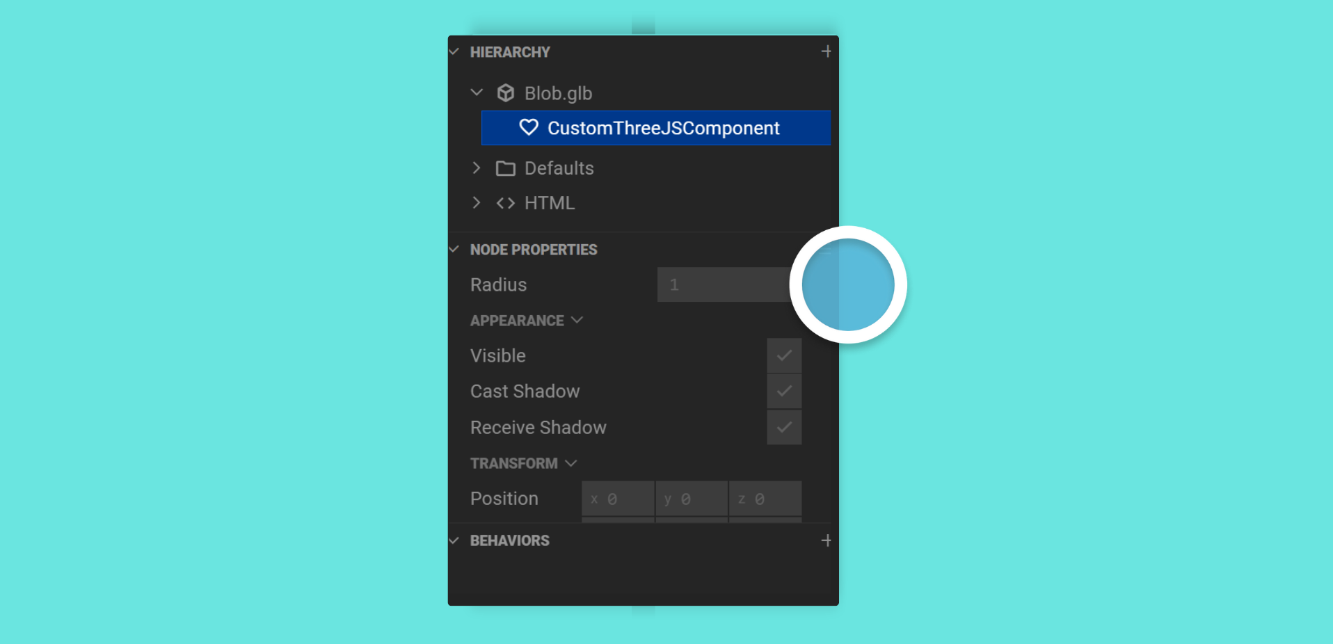
This first change to notice is that we’ve added the details for our radius property to the ConstructorProps interface at the top of our file:
interface ConstructorProps { /** * The radius of the sphere. * @default 1 */ radius?: number}Like runtime properties, constructor properties automatically appear in the editor. Unlike runtime properties (where the default is inferred from the assignment), constructor properties need @default in the JSDoc comment to specify the default value shown in the editor.
Then, in our component constructor, we pass our radius constructor property into the THREE.SphereGeometry constructor function:
// Construct our sphere, referencing the materialconst myObject = new THREE.Mesh( new THREE.SphereGeometry(constructorProps.radius ?? 1), new THREE.MeshBasicMaterial(),);For most of the configurable parameters of your components and behaviors, it’s best to use runtime properties as they give the most flexibility to the user of the entity in the scene - they can be animated and changed during the experience without a reload.
For parameters that need to be passed to the constructors of objects (such as radius in our example above), constructor properties ensure the experience runs consistently.
Customizing Properties with @zUI()
Section titled “Customizing Properties with @zUI()”While properties appear in the editor automatically, the @zUI() decorator lets you customize how they appear:
group- Groups properties together in the Node Properties Panelpriority- Controls the order of properties (higher = closer to top)type- Specifies the UI widget type (e.g.,'proportion','color-hex')values- Constrains values to specific types or autocomplete options
Organizing Node Properties
Section titled “Organizing Node Properties”Use the group option to collect properties together in groups in the Node Properties Panel. You can pass a string or a ZPropGroup object for more control.
The higher the priority number, the closer to the top of the Node Properties table the group will appear.
import { zComponent, ZPropGroup, zUI, zObserve } from '@zcomponent/core';import { Group } from '@zcomponent/three/lib/components/Group';
const appearanceGroup: ZPropGroup = {  name: 'Sphere Appearance',  priority: 20,};
@zComponent({ icon: 'favorite' })export class CustomThreeJSComponent extends Group {  @zUI({ group: appearanceGroup })  @zObserve((value, instance) => {    instance._material.metalness = value;  })  public metalness = 0;
  @zUI({ group: appearanceGroup })  @zObserve((value, instance) => {    instance._material.roughness = value;  })  public roughness = 0;}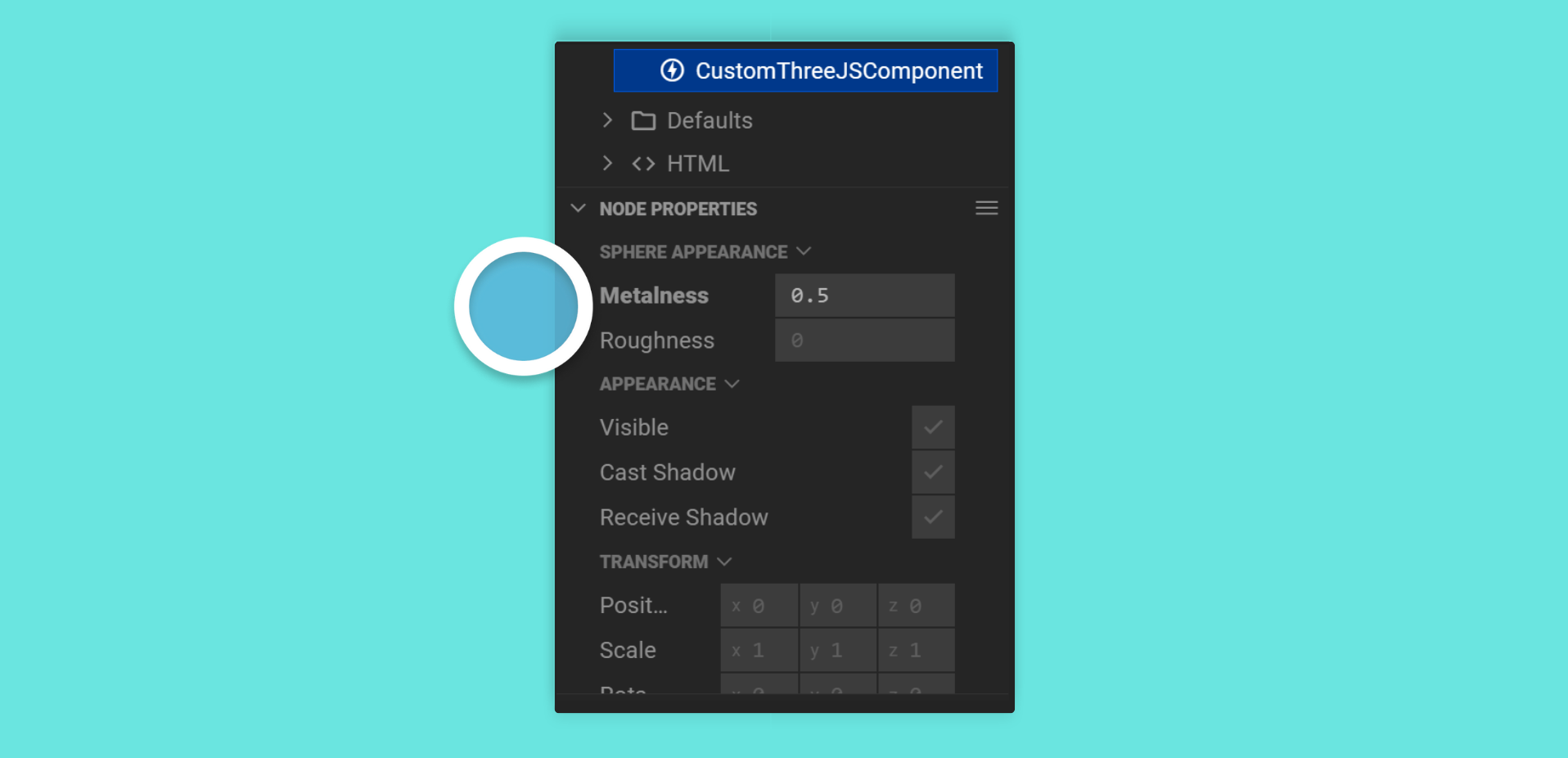
Customizing your Node Properties
Section titled “Customizing your Node Properties”The type option in @zUI() lets you give Mattercraft a hint about how to represent your property in the Node Properties table.
type: 'proportion'
This indicates the property represents a value that goes from 0 to 1. It’s shown in the property table with a draggable slider.
@zUI({ type: 'proportion' })public opacity = 1;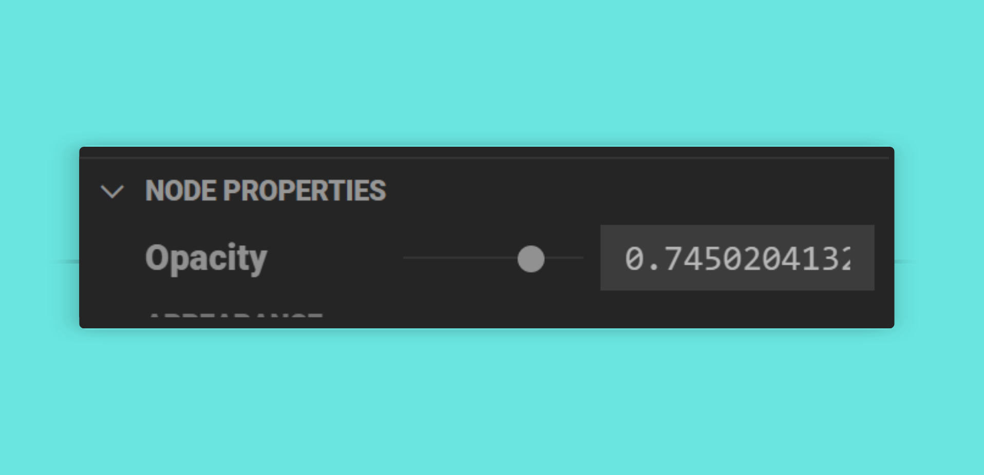
type: 'text-multiline'
Shows a multi-line text input field.
@zUI({ type: 'text-multiline' })public description = '';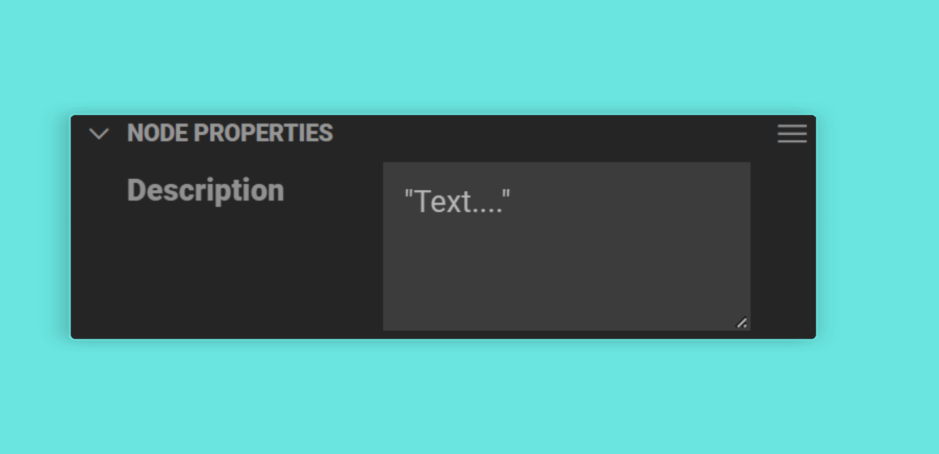
type: 'angle-radians' and type: 'angle-degrees'
Indicates that the property represents a value that’s either in radians or degrees. Mattercraft will show a switcher that allows the user to enter a value in the units they’re most comfortable with and will automatically convert that into the units required by the property.
@zUI({ type: 'angle-degrees' })public rotation = 0;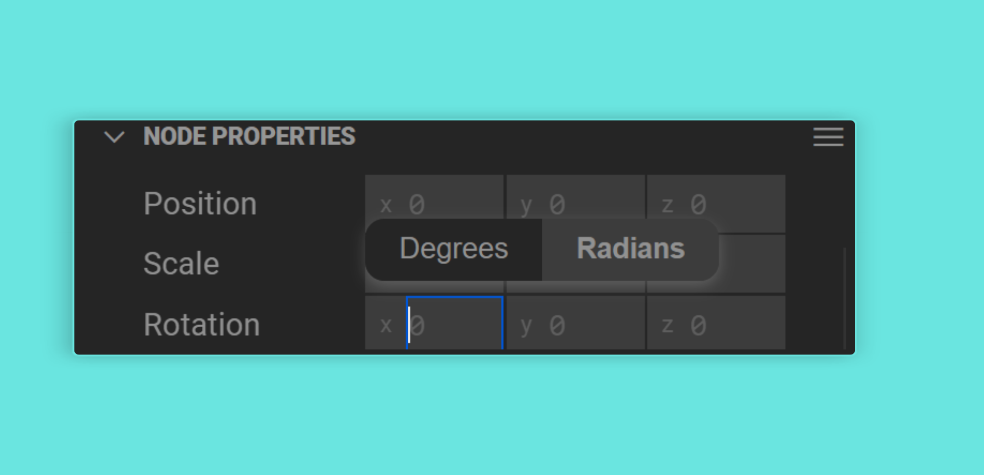
type: 'color-*'
Indicates that the property represents a color. Mattercraft shows a color panel that allows the user to pick a color from a swatch or list or saved values.
The following options are supported:
| Property | Description |
|---|---|
color-norm-rgb or color-norm-rgba |
Represents either a 3 or 4 element array of numbers for red, green, blue and (optionally) alpha, that range between 0 and 1. |
color-unnorm-rgb or color-unnorm-rgba |
Represents either a 3 or 4 element array of numbers for red, green, blue and (optionally) alpha, that range between 0 and 255. |
color-hex |
A hex color string like '#ff0000'. |
@zUI({ type: 'color-hex' })public color = '#ffffff';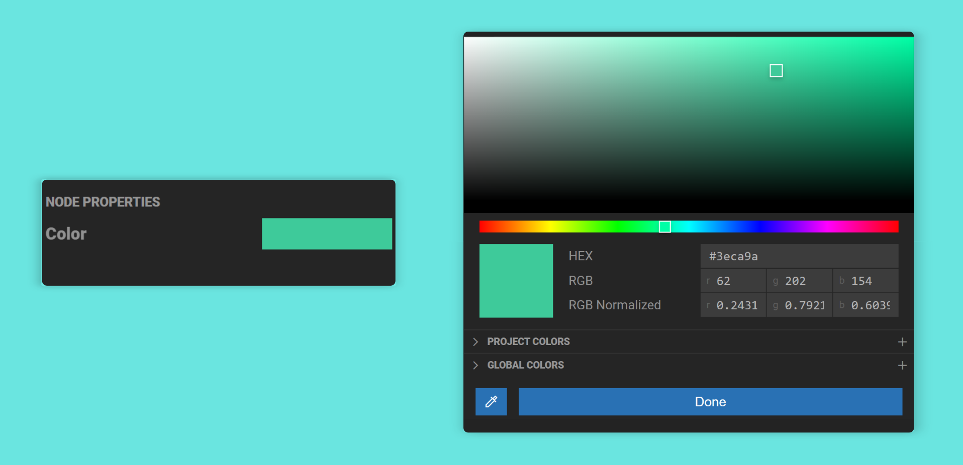
Customizing default Node Properties
Section titled “Customizing default Node Properties”The values option in @zUI() indicates to Mattercraft what values should be shown for this property for autocomplete or user selection.
values: 'files *.+(jpg|jpeg|png)'
Autocompletes a list of files in the project that match the RegExp pattern supplied. At runtime, the value of the property will be a URL that can be used to fetch the file referenced by the property.
@zUI({ values: 'files *.+(jpg|jpeg|png)' })public imagePath = '';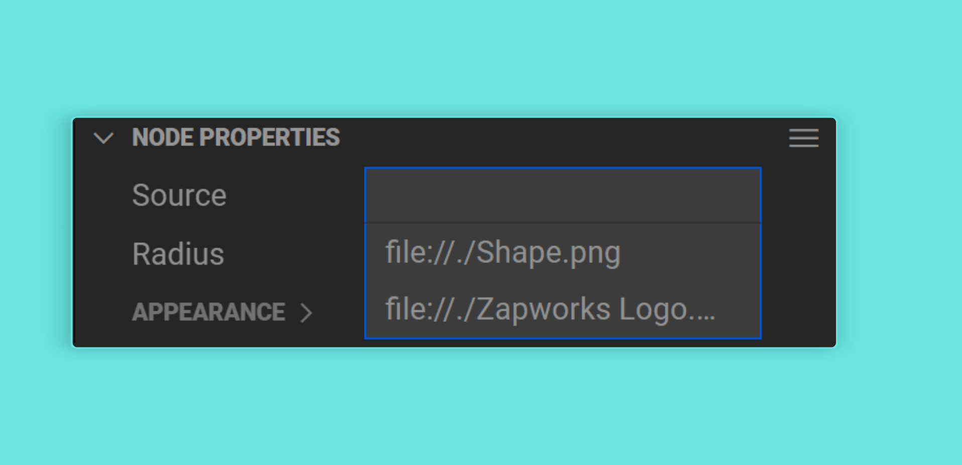
values: 'animations'
Autocompletes with the names of the animations present in the in-context 3D file of this component or behavior.
values: 'morphtargets'
Autocompletes with the names of the morph targets (also known as blend shapes) present in the in-context 3D file of this component or behavior.
values: 'events'
Autocompletes with the names of any events in the component instance that a behavior is attached to and that have been annotated with @zUI().
values: 'nodeids'
Autocompletes with the unique IDs of nodes in the scene. The ID stored in the property can be resolved to a component or behavior using the ZComponent’s entityByID Map:
this.zcomponent.entityByID.get(property);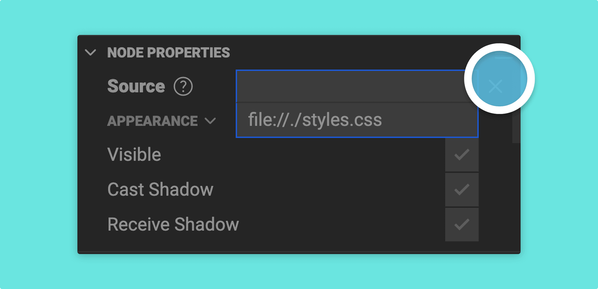
values: 'nodelabels'
Autocompletes with the labels (i.e. the names) of nodes in the scene. The label stored in the property can be resolved to a component using the ZComponent’s nodeByLabel Map:
this.zcomponent.nodeByLabel.get(property);values: 'layerclipids'
Autocompletes with the unique IDs of the layer clips (i.e. timelines or states within a layer) in the scene. The ID stored in the property can be resolved to a layer clip like this:
this.zcomponent.animation.layerClipByID.get(property);values: 'layerids'
Autocompletes with the unique IDs of the layers in the scene. The ID stored in the property can be resolved to a layer like this:
this.zcomponent.animation.layerByID.get(property);