
Creating Custom Components
Components define the different types of Nodes you can have in your project. Each component provides a set of functionalities and properties that you can add as nodes in your project’s Hierarchy, as many times as you like.
While there are many components included with Mattercraft (such as Box and Group) and many more can be added through libraries, it’s possible to write your own in TypeScript.
Understanding Custom Components
Section titled “Understanding Custom Components”Most components in Mattercraft wrap and extend the functionality provided by lower-level elements, be they HTML elements or the objects and concepts from Mattercraft’s primary rendering engine of choice, three. js.
To get the best out of your custom components, we recommend getting up to speed with three.js - it’s a fantastic open-source project with a vibrant community.
There are many reasons you might wish to build your components, for example:
- To build your own custom three. js-based objects.
- To integrate three.js code from other codebases or resources.
- To build your 3D shaders.
- To build components that interact with third-party APIs.
Components in Mattercraft are similar in concept to components in web frameworks like React - they wrap underlying elements (typically HTML/DOM in React, and three.js in Mattercraft) and provide structure around properties and updates to those elements.
Creating a Custom Component
Section titled “Creating a Custom Component”The easiest way to create a custom component is to start with a template. From the Project Panel you can add a new CustomThreeJSComponent which has the outline of a basic 3D component.
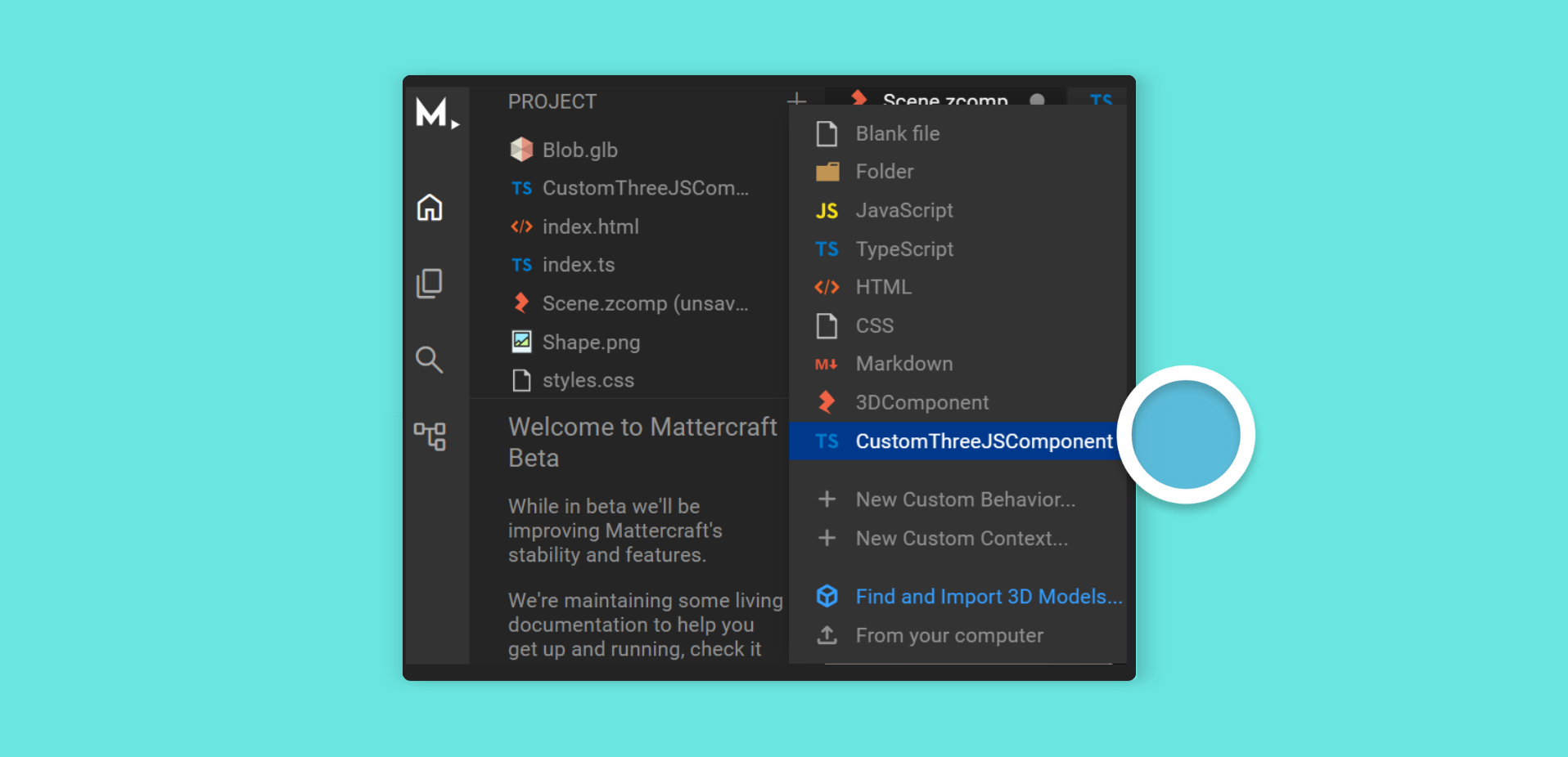
To add a new custom component to your Mattercraft project:
- Click the + (plus) icon button on the Project Panel
- Click CustomThreeJSComponent
- The Project Panel will now have this component script file with the skeleton of a brand-new component:
import { zComponent, zLoad } from '@zcomponent/core';import { Group } from '@zcomponent/three/lib/components/Group';import * as THREE from 'three';
@zComponent({ icon: 'favorite' })export class CustomThreeJSComponent extends Group {
    @zLoad()    private async _load() {
        const myObject = new THREE.Mesh(            new THREE.SphereGeometry(),            new THREE.MeshBasicMaterial(),        );
        this.element.add(myObject);
    }
    public dispose() {
        // Clean up any resources that have been created here
        return super.dispose();    }}
Components are TypeScript or JavaScript classes that ultimately extend the Component class provided by Mattercraft.
In the example above, the component extends Mattercraft’s
Groupcomponent. It wraps a three.jsGroupobject that you can use to hold custom 3D content. This means your component automatically has all the properties you would expect from a 3D object, such asposition,scale, androtation.
Inside the _load function (marked with @zLoad()), we construct a custom three.js Mesh object, passing in our desired geometry and material, then we add it to the THREE.Group object provided to us as this.element.
The @zLoad() decorator registers the method as a loadable process - the loading screen will wait for it to complete before hiding. By default, the method is automatically invoked during construction. If you need to control when loading starts, pass false to disable auto-invocation:
@zLoad(false) // Won't auto-invoke - call manually when readyprivate async _load() { ... }The @zComponent() decorator tells the Mattercraft editor that we’d like this component to appear in the Hierarchy Panel + (plus) menu and right-click menus; and thus make it easy to add to our 3D scene.
See Mattercraft’s full API documentation here.
Using a Custom Component
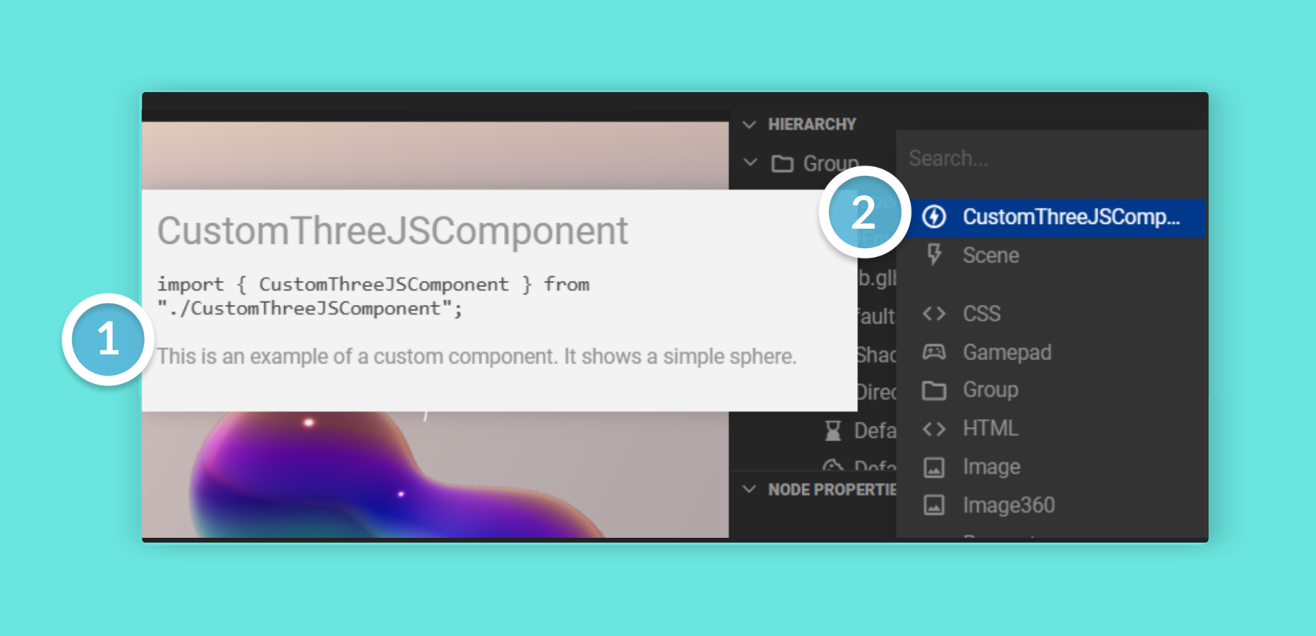
Section titled “Using a Custom Component”Once your component is constructed, you can add it as a child of the root Group node in your scene. Once added and selected in the Hierarchy, you can see your component’s properties in the editor.
Properties
Section titled “Properties”Just as with custom components, you can add properties to your behaviors that can be controlled from the 3D editor.
For more information, see the Properties article.
The Frame Loop
Section titled “The Frame Loop”When 3D experiences run in an end user’s browser, the 3D engine will draw, or ’render’, the 3D scene up to 60 times every second. You may wish to run a script before each render frame.
Use the @zOnBeforeRender() decorator to run code every frame:
import { ContextManager, zComponent, zOnBeforeRender } from '@zcomponent/core';
@zComponent({ icon: 'favorite' })export class RotatingComponent extends Group {    @zOnBeforeRender()    private _spin(deltaTime: number) {        // deltaTime is the number of milliseconds since the last frame        this.element.rotation.y += 0.001 * deltaTime;    }}
For a full example, see our dedicated The Frame Loop article.
Customizing Your Component’s Icon
Section titled “Customizing Your Component’s Icon”Use the icon option in @zComponent() to set an icon for your component in the Hierarchy Panel. Any icon from Google’s Material Icon Set can be used - just lowercase the name and replace spaces with underscores.
@zComponent({ icon: 'offline_bolt' })export class CustomThreeJSComponent extends Group { // ...}For example, the Google Material icon Check Box becomes
check_boxin Mattercraft.
Grouping Components
Section titled “Grouping Components”Use the group option in @zComponent() to specify which category your component appears under in the Hierarchy Panel’s add menu. This could be an existing group, or you can create a new one.
@zComponent({ icon: 'star', group: 'My Custom Components' })export class CustomComponent extends Group { // ...}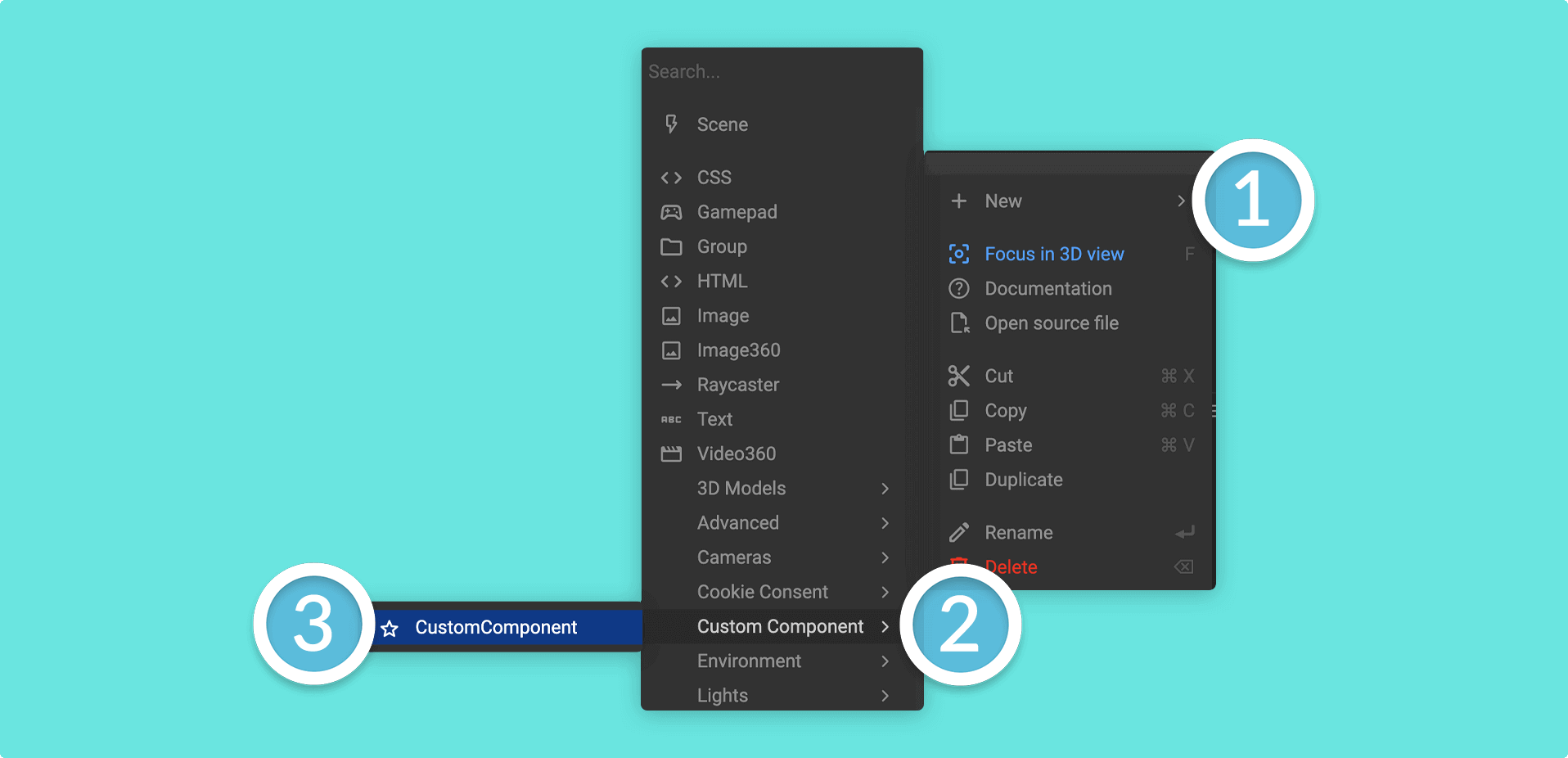
Advanced Component Options
Section titled “Advanced Component Options”The following options are primarily useful when building component libraries or specialized component systems.
Restricting Parent Components
Section titled “Restricting Parent Components”Use the parents option to limit where your component can be added in the hierarchy. This accepts glob patterns matching component tags.
@zComponent({ icon: 'html', group: 'Heading', tag: 'html/element/h1', parents: 'html/element/**'})export class H1 extends ZHTMLElement<HTMLHeadingElement> { constructor(contextManager: ContextManager, constructorProps: {}) { super(contextManager, constructorProps, document.createElement('h1')); }}In this example, the H1 component can only be added as a child of other HTML element components.
Component Tags
Section titled “Component Tags”Use the tag option to assign a unique identifier to your component. Tags are used with the parents option to create component hierarchies.
@zComponent({ icon: 'html', tag: 'html/element/div'})export class Div extends ZHTMLElement<HTMLDivElement> { // ...}Media Stream Components
Section titled “Media Stream Components”Use the stream option to indicate that your component provides a media stream (such as video or audio).
@zComponent({ icon: 'movie', group: 'Media', stream: true})export class VideoPlayer extends Object3D implements Stream { // ...}